Climate Indicators
Temperature
Observed Temperature
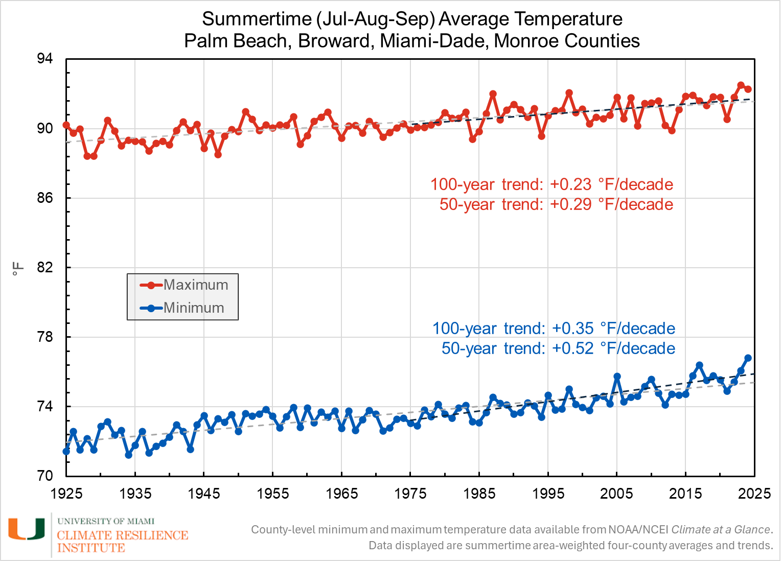
The chart below shows the average minimum and maximum summertime (July, August, September) temperatures, averaged across Palm Beach, Broward, Miami-Dade, and Monroe counties. Those three months were chosen because climatologically, they are the hottest three months of the year in the region, as measured by temperature and by heat index. Annual average temperatures exhibit interannual variability, however, the long-term trend across the region shows an increasing trend. Over the last 100 years, the average maximum temperature across the region has increased at an average rate of 0.23 °F per decade, and in the last 50 years, it has increased 0.29 °F per decade. The average minimum temperature shows a more significant warming trend, increasing 0.35 °F per decade over the last 100 years, and more than half a degree (0.52 °F) per decade over the last 50 years.
Source: NOAA National Centers for Environmental Information (NCEI). This chart is provided courtesy of the University of Miami’s Climate Resilience Institute, 2025.
Observed Heat Index
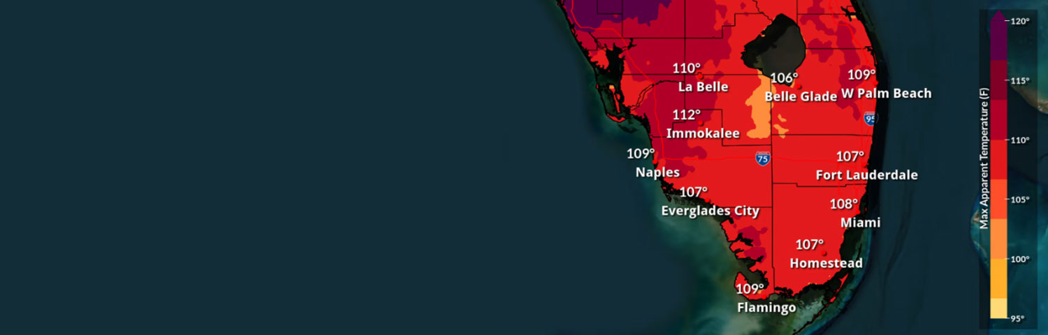
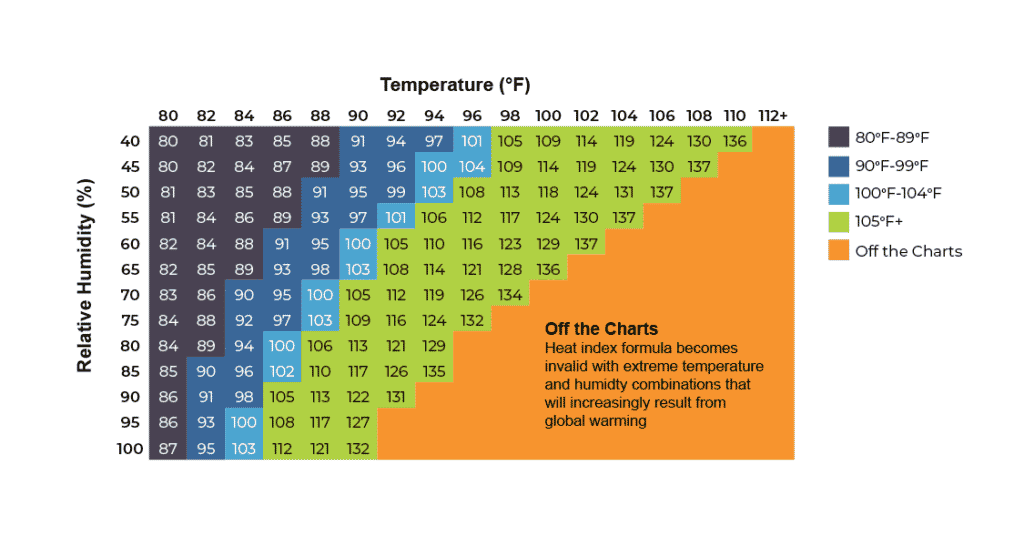
Heat Index is a function of both temperature and humidity—it is a measure of how hot it really feels when relative humidity is factored in with the actual air temperature. There is a direct relationship between the air temperature, relative humidity, and the heat index, meaning that as the air temperature and relative humidity increase (decrease), the heat index increases (decreases). The National Weather Service provides a Heat Index Calculator. As shown in the table below, if the air temperature is 88°F and the relative humidity is 80%, the heat index—how hot it feels—is 106°F.
Beginning May 1, 2023, the National Weather Service Forecast Office in Miami (WFO Miami) began testing a change to the heat advisory and excessive heat warning criteria for public forecast zones in Miami-Dade County, and on July 1, 2024, Broward County joined this pilot program. The new criteria for heat advisory/excessive heat warning for both Broward and
Miami-Dade counties are better aligned with local climatology, as well as recent health data, which indicate that significant health impacts occur at heat index values lower than the current advisory/warning criteria. The Broward and Miami-Dade criteria are as follows:
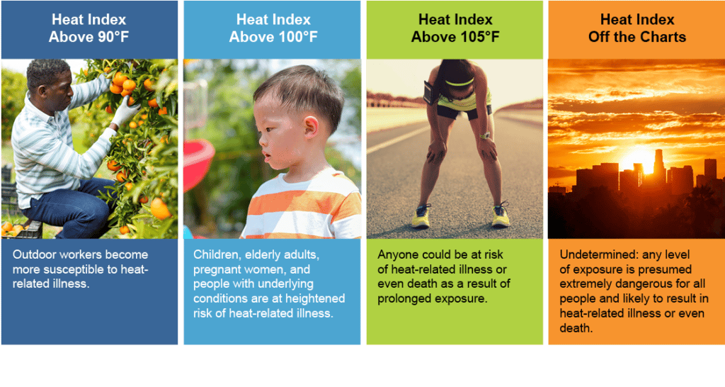
- Heat Advisory: heat index of 105°F or higher for at least two hours
- Excessive Heat Warning: heat index of 110°F or higher for at least two hours
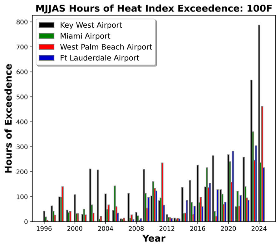
The chart shows the hours of heat index exceedance of 100°F during the heat season in SouthFlorida (May, June, July, August, September) at stations located at airports across each of the four counties—Key West International Airport (Monroe County), Miami International Airport (Miami-Dade County); Fort Lauderdale International Airport (Broward County), and Palm Beach International Airport (Palm Beach County)—from 1996 to 2024. The hourly ambient air temperature and humidity data were collected from the NOAA National Centers for Environmental Information (NCEI), and the heat index was calculated using the formula described in the National Weather Service’s Heat Index Equation.
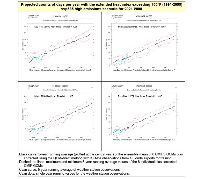
Projected Heat Index
NOAA’s Geophysical Fluid Dynamics Lab Statistical Downscaling Team is actively working on advancing the science related to projecting heat index. At the Compact’s request, this team developed projections of days per year with the extended heat index exceeding 100 °F (1991-2099) using station data from four airport locations in Southeast Florida—Key West International (Monroe County), Fort Lauderdale-Hollywood International (Broward County), Miami International (Miami-Dade County), and Palm Beach International (Palm Beach County). Based on eight CMIP6 climate models, NOAA generated bias-corrected daily maximum heat index time series for these four locations in each county. These projections assume the high emission scenario known as Shared Socioeconomic Pathway (SSP)585, which is considered the upper boundary of the range of scenarios described in the literature.
The charts generated by NOAA provide year-by-year statistics of days exceeding the 100 °F threshold across the eight bias-corrected model results, computing the average of the eight, as well as the largest and smallest of the eight. The five-year running average of the maximum and minimum values is shown as dashed red lines. The black curve shows the five-year running average of the eight models. For reference, cyan dots represent the observed counts of the number of days with heat index values above the threshold of interest for the period 1991-2020, for each airport station. The cyan curve is the five-year running mean computed from the annual observational data.